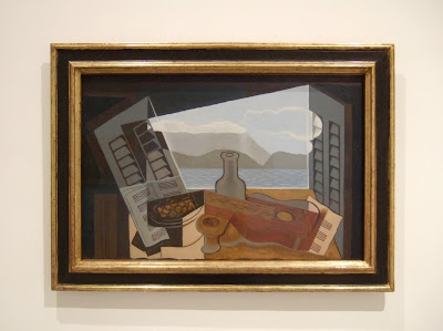
Our pre-vacation research had led us to understand that the Museo Nacional Centro de Arte Reina Sofia, the most recent of the "Big Three" art institutions in Madrid, was a bit of a lightweight compared to grand daddy The Prado and the private boutique collections of the Museo de Arte Thyssen-Bornemisza. Criticism tends to suggest that the Reina Sofia has a "shallow" collection, and that it's a museum built around the star of their aquisitions, Picasso's Guernica. Despite the somewhat condescending narratives, the place is home to many fine pieces and is considered a tourist must-see. It is the one institute of the three that focuses on modern and contemporary art.
In addition, we were already familiar with the fabulous 2005-completed addition designed by Starchitect Jean Nouvel which made it a necessary stop on our itinerary. Lo and behold, we found it to be the most stimulating of the three.
In addition, we were already familiar with the fabulous 2005-completed addition designed by Starchitect Jean Nouvel which made it a necessary stop on our itinerary. Lo and behold, we found it to be the most stimulating of the three.
Image courtesy madaboutmadrid.com
*****
The Art:
OK, let's be frank. We don't know much about depth of collections, heirarchy of lesser and greater pieces, etc. Put us in a room with beautiful art on the walls and we're happy campers. Draw some connections between the historical context of all the various pieces we're looking at and we stroke or chins and say, "oh, that's interesting. Hmm, that makes sense, now." We leave feeling a little wiser and fulfilled by having been in the presence of beauty.
And there was plenty of that at the Reina Sofia. Like everyone else, we made a beeline for the room in the historic Sabatini Wing which houses Guernica. Fortunately they make you work a little for your reward, and the large collection of spaces took us on a tour of the artisitc influences playing out in Spain in the '30s and on into the years of the Second World War. We were quite struck by the role of artists in producing cartoon style anti-fascist propaganda, and were able to directly link that world to the current day, reflected in the exhibition of cartoon art we had seen a few days before at the Circulo de Bellas Artes. And of course, how could there not be plenty of Miro, one of our favourites?
Unsurprisingly, there were many Picasso's, a number of which were studies for Guernica.
...and an assortment of other goodies...
The Building:
The original museum was housed in a former hospital, the white-ish structure at the center of the photo below. It has a lovely courtyard filled with luscious plants and a spectacular Calder mobile on a plinth. Since the renovation, it has become known as the Sabatini Wing, named after it's original architect. The addition occupies a wedge- shaped site fronting a busy boulevard, oriented at an awkward 45 degree angle to the Sabatini.
Nouvel's solution to his design brief was to pull the program spaces apart into three blocks. The largest is an addition to the museum and is attached to the Sabatini via an airy shaft that houses elevators and stairs. The second block is the library/ bookshop structure which parallels the street. The third contains a cafe with a theater space above.
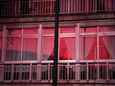
The three blocks sit on a paved plaza which they share with the sculpture 'Brushstroke' by Roy Liechtenstein. Nouvel's masterstroke was to unite the three individual parts with a red aluminum skin and to place a gigantic "floating" shiny red ceiling on the space. The roof structure is punctured with enough skylights that the space isn't dingy, and in fact, it must be a very cool oasis in the scorching heat of a Madrid summer.
Image above courtesy arcspace.com
image above courtesy viajejet.com
Above, the Liechenstein sculpture
with the museum entrance behind.
Below, the library stacks are partially sunken below the plaza.
The red roof floats above the open air plaza,
hovering above the old Sabatini Wing.
Below, the red facades and ceiling have a strong impact on the immediate neighbourhood.
image above courtesy arkitectoniq.blogspot.com


No comments:
Post a Comment