As we reported earlier, it is the quality of Trade Day speakers that draws us each year to the Interior Design Show. This year we were especially determined not to miss the event as current Super Star Bjarke Ingels was the day's wrap-up guest. First, though, we heard from Matali Crasset at 11:00AM and Fabio Novembre at 1:00PM. Here are the bios for all three from the IDS website. Little did we realize as the day began that we were about to have a first hand lesson in European cultural stereotypes!
Matali Crasset
Unfortunately, we just did not connect at all with Matali Crasset. Perhaps she was nervous or jet-lagged, but she came on strong and moved at a very rapid-fire pace through several hundred slides. It was a bombardment of images of her work without any real explanation of context, process,....anything that would have helped explain the logic behind her quirky forms and stripped down material palette. It was just not a good presentation.
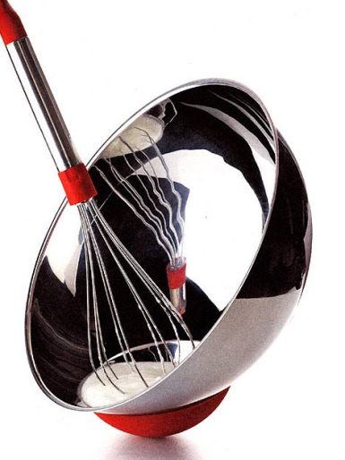
With the perspective of a week, our impression (based on the 60 minute presentation and a review of images available on the web) is that Ms. Crasset is strong in Industrial Design and not so much in the areas of Interior Design and Architecture. She is great at shaping objects- we actually love her "cul-de-poule" mixing bowl for Alessi- it is extremely practical in that it can be positioned on its base to suit your specific task, the silicone bulge can be used to grasp it for hand mixing, and all the while it looks terrific:
top: mocoloco.com; bottom: fastcompany.co
Here's an article in FastCompany for some background.
But when it comes to crafting spaces or giving form to inhabitable structures, it seems that the exact same logic is applied in her responses. Everything seems to be simply a collection of objects. The HI Hotel in Paris is one example of an interior renovation she has undertaken, and in our opinion it seems to be little more than an imposition of forms and materials into the volume of some small hotel rooms. What is lacking is the creation or manipulation of the actual SPACE. If any money was expended moving walls inside that building, it was not money well spent! Here's a short video of the hotel interior:
HI-MATIC from Matali Crasset on Vimeo.
The largest amongst the few architectural designs presented was one for the same hotel chain as HI Paris, this time at a desert oasis town in Tunisia. The DarHI Hotel sits on a ridge at the top of the village with a view over the beautiful oasis at the center. Sticking to the regional norms, the hotel is within a walled compound, which once again gave Ms. Crasset the opportunity to fill a space up with a bunch of objects. She then took those objects (the buildings) and filled them with more objects. See what you think:
both photos above courtesy designboom.com
OK, we think you get our point. We'll move on now.
Fabio Novembre
An hour after Ms. Crasset finished speaking we re-assembled to hear from Fabio Novembre, someone who could not possibly have been more different. Aloofness was pushed aside by effusive passion, and so commenced a 90 minute group therapy session. Women, beauty, snakes, honesty and love: these were the touchstone's of Mr. Novembre's talk, although there were many, many more influences. With an impressive slide show of art through the ages to demonstrate his talking points, he set about to explain his modus operandi. Whereas we struggled to understand Ms. Crasset's approach to solving a design problem, with Mr. Novembre we were smothered in his intentions! Professing that ideally we would ALL be sitting together naked, sharing ideas, he proceeded to expose his inner self.
Citing his Southern Italian upbringing (southern being very importantly different to Northern Italian) he spoke of his love for women (both mothers and sex goddesses), the Church (oppression and beauty), snakes (symbol of evil in the West, protector in the East), honesty (his self knowledge guides his design), love (the greatest creative inspiration of mankind- Cupid is one of his branding tools), etc. It was both mesmerizing and cloying all at the same time, much (as he would admit) like the "poor man's" baroque architecture of his home town, Lecce.
The baroque vision of "less"
Fabio/ Twenty First Century Cupid
Love Opens Doors lever set
(above two images courtesy the Novembre website)
"Him" and "Her"- Novembre's "improvement" on the Pantone chair
(image courtesy Dezeen.com)
As different as they were in their presentations and approaches, so were Matali Crasset and Fabio Novembre different in the results of their design efforts. Whereas Ms. Crasset's strength is in her industrial design, we find that of Mr. Novembre to be too flighty. On the other hand, where she stumbles in defining interior spaces, he succeeds. A couple of bars tell the story.
This little hole in the wall in Lodi, Italy is attuned to the fact that a bar's strength is often in its crowd. It uses ghosts and shadows to populate the space before it fills up.
And this club in Milan, named Divina, takes female idolatry to new heights by transforming famous nude paintings into wall decor, and treating the whole disco as if it were a museum. (Read the designer's brief and see more images here)
(Divina images from the Novembre website)
A post-presentation question from the audience about his opinion on the state of present day European affairs brought on a 20 minute sermon that moved from despair (with actual tears) about the bad influence on youth of Berlusconi (they all think they can get whatever they want without hard work) to the power of positive energy to conquer all. Quite a remarkable performance!
Bjarke Ingels
Somewhat reminiscent of a three act rock concert, with only 35 minutes or so until the next presentation, immediately following Fabio Novembre's wrap-up the crowd began to swell and buzz in anticipation of the headliner. The "b(r)and" BIG and its front man Bjarke Ingels were in the house! By the time he took to the stage it was beyond Standing Room Only!
Bjarke Ingels swung our European tour back northward from the land of love and passion to the pragmatism of Scandinavia. The affable Dane, dressed in trademark jeans, T-shirt and hoody, embodied the Nordic stereotype of deeply-rooted common sense infused with wry humour. His well practiced talk (see below) outlined his firm's philosophy for Hedonistic Sustainability. Starting from the very sensible premise that we will never get a widespread social buy-in to a sustainable lifestyle as long as it is framed in the negative (ie. what you must give up or do without), he argues through his practice that we must define sustainability by what it can offer us. In other words, appeal to everyone's self interest rather than their sense of virtue. And while we're at it, let's make it fun rather than sombre.
Bjarke walked us all through his greatest hits, including the Mountain Dwellings which rise from the flat Danish plain south of Copenhagen, where every apartment gets a large terrace and where the perforated aluminum screening around the parking garage is pierced so that its differently sized holes create the bizarre juxtaposition of an image of the Alps (read more here)...
"A major part of it is you put your money where your mouth is and really make this shit happen," Ingels says. "People always somehow misunderstand the light-heartedness of our discourse, the fact that we just play around. If you want to break the mould, if you want to do something surprising or different, [you need to do] three times the work to make it convincing. If you just follow the standard, you don't need to make it up because it's already done. You have to take the playfulness really seriously to get it to work."
This loops us nicely back to comments that Fabio Novembre made earlier in the day about Berlusconi's tragic lessons to the young people of Italy that it's possible to cut corners and succeed without effort. As any designer will tell you, the result that ends up appearing the simplest or most effortless only comes about through a lot of hard work!
Bjarke walked us all through his greatest hits, including the Mountain Dwellings which rise from the flat Danish plain south of Copenhagen, where every apartment gets a large terrace and where the perforated aluminum screening around the parking garage is pierced so that its differently sized holes create the bizarre juxtaposition of an image of the Alps (read more here)...
images: homedesignfind.com
...to the Figure 8 housing block, which ramps the surrounding sidewalks up and through the complex, instantly creating a destination for Copenhageners to visit because it affords them a rare promontory from which to view their surroundings (more here).
top:openbuildings.com; bottom: architectour.net
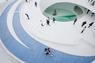
The Danish Pavilion at the Shanghai World's Fair in 2010 was a near perfect example of national branding. Trading on Copenhagen's current cool cachet, including its internationally known cycling culture, visitors could hop on one of the city's bike-share cycles and ride a spiraling bicycle path to the top of the structure. At the bottom, a pool filled with Copenhagen's now super clean harbour water housed the real Little Mermaid, on loan to China for the fair. Read and see more here.
courtesy archithings.com
Perhaps most emblematic of BIG's playful sensibilities is the scheme for a new trash incinerator in Copenhagen. The facility would need to be colossal in size to store then burn a mountain of garbage. Since they were dealing with a mountain, they theorized, why not turn it into a ski hill and save everybody a 5 hour trip to Sweden? The incinerator was to be the world's most technically advanced, bit since it was not perfect the design called for the top of the hill to blow a smoke ring for every ton of CO2 released into the atmosphere. That way, the reasoning went, any pollution was clearly visible for what it was, inciting citizens to consider putting less waste into the trash bin. Apparently this project has been cancelled due to concerns that incineration is not yet a clean enough solution. No one wanted to make such a statement then be stuck with a monument to obsolete technology.
BIG has built a reputation for creating design solutions that are way outside the box yet respectful of client budgets. Obviously this has contributed a great deal in their success, but for the firm's architects it means a longer and more intensive design process. The following quote is lifted from a long but really great article about BIG here on Wired.co.uk:"A major part of it is you put your money where your mouth is and really make this shit happen," Ingels says. "People always somehow misunderstand the light-heartedness of our discourse, the fact that we just play around. If you want to break the mould, if you want to do something surprising or different, [you need to do] three times the work to make it convincing. If you just follow the standard, you don't need to make it up because it's already done. You have to take the playfulness really seriously to get it to work."
This loops us nicely back to comments that Fabio Novembre made earlier in the day about Berlusconi's tragic lessons to the young people of Italy that it's possible to cut corners and succeed without effort. As any designer will tell you, the result that ends up appearing the simplest or most effortless only comes about through a lot of hard work!
If you want to see pretty much the same presentation as the one Bjarke made in Toronto at IDS 12 (except this one's a little quicker) check out his Hedonistic Sustainability TED Talk here:


No comments:
Post a Comment